Decided to do this design brief challenge from Brief Club : a crystal and wellbeing shop that needs a logo (plus any extras).


(All images found on Creative Commons).
Decided to do this design brief challenge from Brief Club : a crystal and wellbeing shop that needs a logo (plus any extras).
(All images found on Creative Commons).

Recently, I decided to create a can label for fun as a way to get back into product design while incorporating digital illustrations.
My partner and I have been trying to expand our beer palates by checking out local breweries and trying buying interesting looking beer flavors whenever we get the chance. So far, we haven’t had much luck finding a flavor or variety that we like – with the exception of blackberry cider.
I decided that it’d be fun to create my own version of our new favorite drink. I wanted to stick with a monochromatic color scheme here and utilize royal purple as the focal point. As I was brainstorming on ways to illustrate the more tangy, fruity notes that blackberry cider tends to have, my partner told me a story about how he used to accidentally prick himself on blackberry bushes when he was a child. I thought it would be interesting to find a way to blend that in with the design and ended up settling on a slightly medieval/fantasy approach.
The sword and wolf illustration were both hand drawn before being refined and finalized in Illustrator:


2020 was a strange year for everyone, myself included, but one of the things I wanted to keep doing was expanding both my design and illustration skills as much as possible. That resulted in me tackling a new vector illustration for the first time in awhile.
I’ve always been widely influenced by music and I decided to make the focus of this project one of my favorite hip-hop artists, Post Malone. I’d drawn a traditional sketch of Post Malone a few years previous which I created in an angel motif. For this new piece, I thought it’d be fun to make a devil motif to pair with it.
I started off this project as I do with all my vector illustrations: I made an initial, hand-drawn sketch. I section off areas of the sketch that will make it much easier to vector once the image is scanned.

I then worked on the vector line work before adding color:

The final color stages went through two revisions and I also decided to add a background. The black hat ended up being more consistent with the vision I had and a better overall fit design-wise:


Overall, I feel like my process is more refined and that I can continue to work on more detailed, in-depth illustrations in the future.
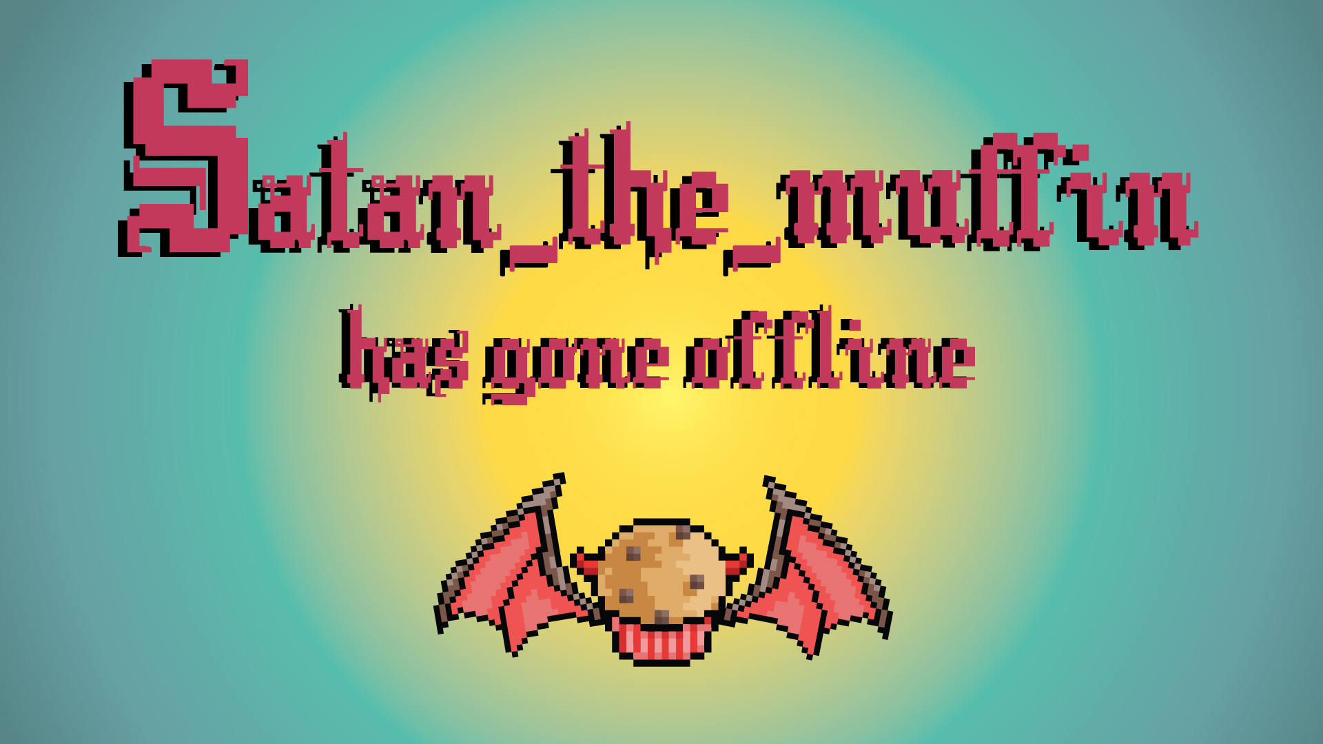
I recently had the chance to create the visual identity for Twitch streamer satan_the_muffin.
I started off with a few traditionally drawn concepts when brainstorming icon ideas. The first image was hand-drawn before being vectored. I further refined the image by adding color and simplifying. Since the icon was going to be small, I knew it was important to create something that was easily recognizable and wouldn’t lose detail when scaled down.


After getting some ideas down to show, I further discussed the future content of satan_the_muffin’s Twitch streams. He explained that he was mostly interested in indie games and a big fan of the game Runescape. I decided that pixel art would be the best fit given this information. This was my first time making pixel art which was a fun challenge. I took my watercolor image and pulled out the main elements to use as a base for my pixel muffin.
I also created additional pixel wings to create a pixel animation for use during streams.


The final part of the visual identity were some page banners and an away message screen. I edited a free pixel font to round out the old school videogame concept.


Pabst Blue Ribbon held their annual PBR Art Contest which I was inspired to enter. I started off by writing down concepts and ideas that I thought of while researching about the company. Based on both their website and social media accounts, it was clear that PBR prides itself on being a drink associated with community. I decided to revisit an old art concept I had and give it an update. Here are some of my initial sketches and the first concept:


I eventually decided I wanted something more engaging so I made skateboarding the main focus. Here are the second set of sketches:


And the final can design:
Over the summer, I was selected to be a graphic design volunteer for the Organization for Transformative Works (OTW) Communications department. The Communications team is the central information distribution arm of the OTW, responsible for distributing information to the general public, the media, fans, and other organizations. Communications is also responsible for posting content to the main OTW blog (tw.org), as well as cross-posting content from the OTW blog onto AO3, social media, and other OTW outlets.
As part of the volunteer committee, I was tasked with creating banners to be used on the main OTW blog site that adhered to company branding standards as well as file specifications. I was responsible for the creative direction of the banners and all illustration work was created on my own.
The typewriter illustration separately. Image was sketched out on paper before I used Illustrator to create a vector image.

Recently, I’ve wanted to get back into doing some vector illustrations and I was inspired to do a character illustration based on the indie horror game, “Sally Face“, created by PortableMoose. Going into this, I really worked on refining my sketch before taking things over to the digital realm. I also had time to record a bit of my process which was a lot of fun: https://youtu.be/OF8qUrjQjNs

The East Coast Gaming Conference held their annual t-shirt contest for their 2019 event and this is the design I submitted. I took inspiration from the 80s and used bright, vibrant colors and an older television. No copyrighted images could be utilized so I decided put the focus on gamers as a community rather than any one console or company. The rules outlined that only four colors could be used so I went with a simple color scheme. The name of the conference as well as the abbreviation “ECGC” were also to be featured in the design.
I drew out the illustration by hand before vectoring the image using Illustrator. I colored the illustration using Photoshop. The East Coast Gaming Conference font was supplied.


Jerry’s Artarama needed artwork for a promotional giveaway that was being shared on the company’s Facebook page. The artwork needed to use the advertised canvas boards as well as adhere to company standards and showcase other featured products.
I created a painting for them to use as well as helped to ‘stage’ the photo. The painting was made using acrylic gouache on textured canvas board.


As of March 2019, This illustration was chosen as the second place winner for the Wake Technical Community College’s Northern Campus mural!
Wake Technical Community College’s North Campus was looking for submission’s for a mural to be hung in the student lounge. I chose to go with something that represented North Carolina so I went with a lighthouse. I wanted to emulate a sunset so I chose a warmer color palette. I also knew that I wanted to do a postcard design so I went with a font that was reminiscent of old postcards and added in a white border.

